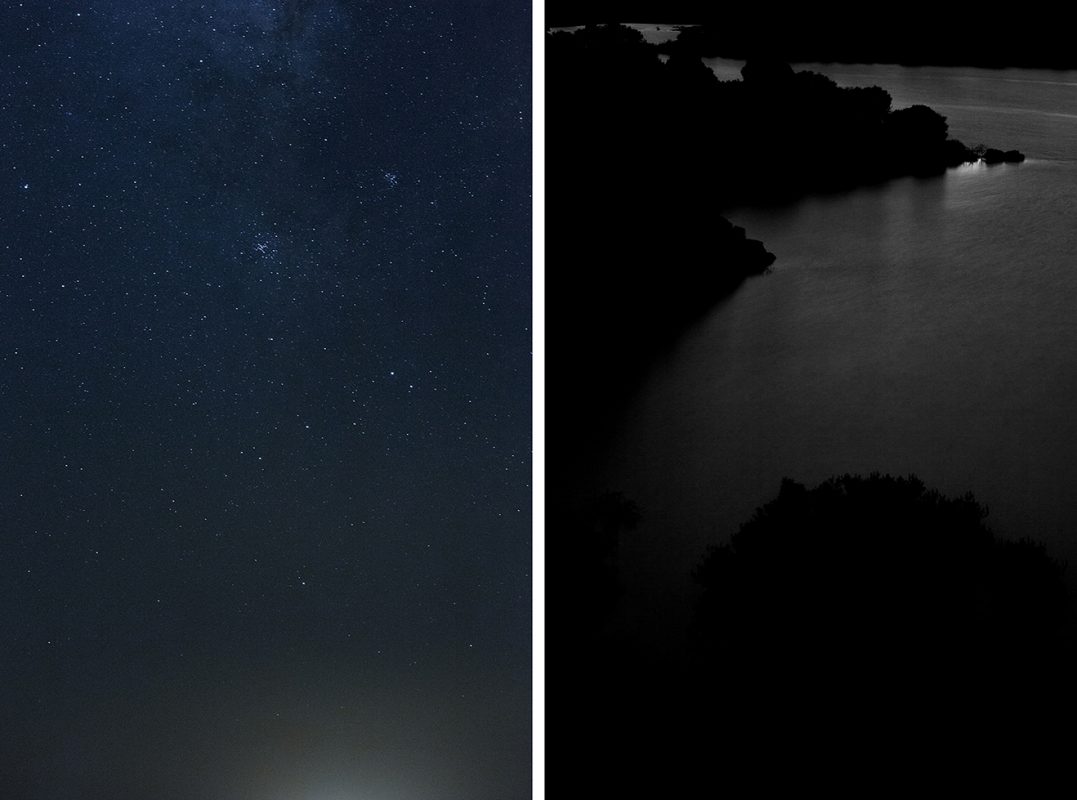
Robert Hutinski

Atavism

AKINA Books

A privately published, hand made book, Robert Hutinski’s Atavism ostensibly shows family archives from Celje, Slovenia, prior to the Nazi holocaust, which are then are redacted and excavated; creating absence that perversely translates as a contemporary memento mori. In doing so, it invites us to empathise with what is popularly described, as the ‘spectre of fascism’ being ever present.

In Michael Haneke’s 2009 film, The White Ribbon, various set pieces based in rural Germany of the 1910’s presciently suggested the violence yet to appear in WW1. The actual conflict wasn’t yet physically present and rather than rely upon a reiteration of its consequences Haneke conjured a heavily charged prelude via the everyday. Family and documentary archives can act as a final point, a fixed marker in time, yet Hutinski’s digital interventions into the photographic vernacular, reposition fragmented lives, which disappear before our eyes.

We witness no trauma, but gaze at victims before they become so. Any ‘double violence’ has yet to occur, not with the act of photographing, but genocide. We find ourselves at the limits of allegory, the works projecting tragic inevitabilities and us, unable to act to change the course of history as if the sequence is set to repeat. Perhaps, predictably, I hear TS Eliot’s Bin gar keine Russin, stamm’ aus Litauen, echt deutsch as I hold what begins to feel like a slim prayer pamphlet in my hands. The object’s intelligent design and use of semi-transparent papers combined with image manipulation and sequencing offers it’s own interpretation of uncertainty.

Surprisingly, Atavism relies not on indexicality; the images may have been made contemporarily, but a seductive and emotive power through aesthetics, collective consciousness and design. Hutinski knows that to continually reemphasise such histories, to keep these ghosts alive, is essential, but, and whether this is by choice or circumstance I do not know, what happens when an elegiac and beautifully created testament to loss such as this can only be owned by a handful of collectors?

—David Moore

All images courtesy of Akina Books. © Robert Hutinski

Virgílio Ferreira

Being and Becoming

Essay by Tim Clark

Heraclitus, the somewhat contemptuous Greek philosopher who was active around 500BC, posited the idea that change is at once the most constant and essential element of life, when he ventured, “No man ever steps in the same river twice.” More specifically, this aphorism has largely been interpreted, on the one hand, as comparing existence to the flow of a river – given that all things pass and nothing stays – but perhaps more importantly, on the other, as a rumination on the impossibility of coming into contact twice with a mortal being in the same condition.

The statement could also be a useful coda for discussing the new body of work by Portuguese photographer Virgílio Ferreira, entitled Being and Becoming. Couched in a symbolic, literary mode of photography, the series is a subjective and dreamy meditation on the lives and environments of several migrant workers from Portugal, who left their country of birth to start a new life in new lands, principally due to economic reasons.

Courage, upheaval, the promise of opportunity; unfreedom, self-respect and heroism, not withdrawing the possibility of exploitation and poverty – the ultimate capitalist ethic – are all defining features of the migrant experience. Yet rather than exploring material or socio-political circumstances, Ferreira attempts to evoke inner feelings, opening up a perceptual space for reflecting on the construction of “hybrid-identities and the polarity of living in-between cultures, languages, landscapes and borders” – subject matter that is encapsulated and triggered by his subjects. Similarly, the work does not fall into a neatly-defined story since the mood and locations are too ineffable to operate in the documentary vein. Instead, Ferreira sets forth the notion that his protagonists are in fact part of a much larger, collective phenomenon and thus his approach to the topic of immigration is to connect to broader issues of memory and belonging, mobility and boundary.

What Ferreira also offers encompasses concepts of the third space and the Old and New, as he explains: “According to some scholars, the third space is an interaction and articulation with two or more cultures and languages. The Old and the New are states of being; negotiations between social, national, geographic and linguistic spaces. Homi Bhabha claims that these negotiations are ‘the process of cultural hybridity’ which ‘gives rise to something different, something new and unrecognisable, a new area of negotiation of meaning and representation’.”

In his coolly analytic quest to establish meaning, one of the picture-making strategies Ferreira uses to conjure up something of this sense of duality is diptychs; scenarios where he is drawing out deep correlations between the spaces, surfaces and people he elects to photograph and juxtapose. Many comprise solitary men or women or sometimes pairs of people who appear dislocated from their surroundings, although repetitions of the same individual may be seen within a diptych. Let us consider an example of the latter, the diptych that presents two portraits – one in black and white, the other in colour – of a middle-aged woman lost in her own private world of thought. We can only imagine that she is nostalgic and homesick. After all, Ferreira typically locates, understands and describes the human predicament by tapping into feelings of isolation and longing and through piling melancholy on melancholy. But there is also something profoundly empathetic and life-affirming about this picture: her past exists as a free-standing memory, the future as hope and anticipation, and her aims and recollection are the building blocks between the two.

In parallel to this, as is the case elsewhere in the series, we can clearly witness the feeling of being uprooted in a foreign country or of seeing oneself through the filter of difference in an adopted city. With its unerringly psychological portrayal of the individual, this kind of photography specialises in silence and darkness, and unlocks even awakens a sensation of anonymity. As such, it might be argued that Ferreira converts this into his true thematic.

These thoughts press harder when we pause to reflect on the distinct atmosphere emanating from and within the images. Ferreira’s photography does not take its cue from the drama of events, rituals or spontaneous actions, but opts for a language of complexity that is alive with ambiguities to make visible a disquieting feeling of loneliness and alienation. Perhaps this is why a great deal of the photographs in Being and Becoming do not seem to be of anything much except people drifting away in moments of repose. As Ferreira, holding this in the balance, writes: “What I intent to depict is not only the human presence, but emotional aspects or inscriptions (on people’s faces or bodies) that may have an immaterial and vague quality, while symptomatic enough and able to reveal something.”

That certain something is indeed incredibly subtle and nuanced. Arriving in these quiet yet intense photographs, figures vie for prominence but are routinely blurred and shift in and out of focus amid expansive landscapes, while at other times their depiction gives way to shadows or simply teeters on the threshold of visibility altogether. Ferreira’s images appear fluid, unfixed and transitory, as are the subjects he portrays. They play with diffuse traces, obstructions and layers of dappled light to lock us in moments where elements of past and future coalesce with the present.

Nowhere is this more evident than on the occasions where Ferreira has produced works by means of multiple exposures (without resorting to digital manipulation), one half literally acting as a mirror image of the other, and in composition and lighting they fuse together perfectly. His aim, as he states, “is to create a notion of continuity between ‘there’ and ‘here’, where two points in time overlap in the same place.” The most affecting case in point is a close-up of water rushing over a stone in a river, which he has then moved and re-photographed. The resulting composite creates a simultaneously disorienting but powerful impression; now stalled and loading the photograph as a form of allegory and an expression of the dichotomy between presence and absence.

In a sense, the photographs seen in Being and Becoming are more like a collection of proverbs that speaks to certain universal truths. Something is happening here that heralds a unity of opposites, a flux doctrine that ultimately points to the way things are the same and not the same over time. Now is then: what came before comes after. Here is Virgílio Ferreira rallying at Heraclitus’ defence in 2014.

All images courtesy of the artist. © Virgílio Ferreira


Tim Clark is a curator, writer and editor. Since 2008 he has been Editor in Chief and Director at 1000 Words Photography Magazine. Previously Associate Curator at Media Space, The Science Museum in London, exhibitions he worked on included Julia Margaret Cameron: Influence and Intimacy (2015) and Gathered Leaves: Photographs by Alec Soth (2015-2018), a major, mid-career touring retrospective. He has also organised many exhibitions independently, most recently Peter Watkins: The Unforgetting at Webber Gallery (2017) and Rebecoming: The Other European Travellers at Flowers Gallery (2014), featuring works he commissioned by Tereza Zelenkova, Virgilio Ferreira, Lucy Levene and Henrik Malmstrom. Together with Greg Hobson he has curated Photo Oxford 2017, which featured numerous solo presentations by artists such as Edgar Martins, Mariken Wessels, Martin Parr and Sergei Vasiliev and Arkady Bronnikov from The Russian Criminal Tattoo Archive among others. His writing has appeared in FOAMTIME LightboxThe TelegraphThe Sunday TimesPhotoworks and The British Journal of Photography, as well as in exhibition catalogues and photobooks. He is also a visiting lecturer on the MA in Photography at NABA Nuova Accademia di Belle Arti Milano.

Cristina De Middel

Party:(Quotations from Chairman Mao)

Interview with Brad Feuerhelm

Quotations from Chairman Mao Tse-tung, commonly known as the Little Red Book, remains one of the most widely printed books in history. First published by the People’s Liberation Army in 1964, it was a totem facet of every Chinese household during the country’ Cultural Revolution. The book, though not stated as such, was an unspoken Bible of necessity for every party member, printed in small sizes in order that it could easily be carried around and bound in vivid red cover. When issued, it literally changed the shape of publishing in China. Presses for other books by Vladimir Lenin and Friedrich Engels were put on hold, so that Mao’s could be printed and celebrated to marvelous effect by the machine of Chinese communism and the ego affect of the Chairman himself. Economically devising a way to put himself on par with the great thinkers of communism by tyrannical control over the presses, Mao’s spread of influence was capitalised in effect by economic bullying of the Chinese printing industry. A great sense of irony permeates over this.

Cristina De Middel, whose The Afronauts marked an unparalleled rise in photobook fetishism has now reworked Mao’s book. She has combined photographs from a recent trip to China with a series of interventions with the original text. Text negation, as seen similarly in the recent Adam Broomberg and Oliver Chanarin’s Holy Bible has a long history; the conscientious obliteration and reshaping of contextual meaning through absence or striking out of text was a pursuit purloined from the Dadaist tradition and also more singularly by Sicilian artist Emilio Isgrò. Mao’s red book is perhaps the perfect untapped fodder for such treatment given that China is very much undergoing a major transition, both ideologically and economically. The Cultural Revolution is teetering on the brink of capitalist largesse and De Middel’s book points to a series of propositions about this ‘party’ change.

Brad Feuerhelm: Cristina, can you give us some insight on why you felt the Little Red Book was due for re-examination?

Cristina De Middel: I didn’t start with the Mao book from the beginning. I just used the Mao book as a structure for the pictures I had taken. It was the structure I was missing. The images were quite random. It was not for a specific project.

BF: Do you feel that the original book itself holds any truths about the China of today or is it in any way a sacred cow of literature and ideology in need of some abuse?

CDM: I don’t think it is any of these things. For me it is a historical object, a testimony of something that has happened in the past. It has no literary value. It is simply an ideology put together – it’s just like the Bible. It is full of information, full of perspectives that are of no use anymore.

BF: When I look at the choices you have made regarding the text negation, I feel a certain amount of dysphoria involved. The words ‘struggle’, ‘people act blindly’, ‘oppression’, ‘negate universal truth’, and simply ‘why’ point to series of propositions regarding the measure of failure of communist philosophy for that of a sort despondent embrace of capital in the country. Is this an intentional measure or have we taken it upon ourselves to load such an already loaded tract with obsequious negativity?

CDM: The edit of the text is very intentional. It is meant to transmit my mood at the time. It is closer to a personal diary, using China as a failure for utopia. It was also about the moments I was going through there while shooting.

BF: The photographs themselves align quite cleverly with some of the text whether representational images of hands or people pictured in scenarios where they are partying. Did you add the photographs to the text or vice versa?

CDM: I had a lot of the images as a result of spending three months in China during the time I was working on The Afronauts, and I wasn’t sure what to do with them all. I needed to find a structure for this. The failed utopia was a perfect structure – turning a political statement into a personal diary and vice versa. It is the most personal work I have done to date because it may be well hidden, but the book reflects myself very much so at the time – my outlook. I was in a very personal crisis. I had quit my job. I had personal issues, so I went to China to reset myself. I was taken with the idea of rediscovering the pleasure of photography, taking pictures on the street, but also adding a personal perspective of the images.

BF: The images themselves are quite different to those of The Afronauts, where the fictive elements of storytelling and documentary practice cross boundaries to present a fairytale synthesis of unreality. This presumably hints at the fallacy of representation in photographic practice. In part, the images seem to have a more literal, less fantastical shape to them given your prior career as a photojournalist. Was this employment of more traditional, let’s say, more static image selection done on purpose or was it the sequence of events in China itself that led to the making of images? They feel less staged than the images in The Afronauts….

CDM: I am more known now for my fictional stance to photography and documentary practice. That being said, it is more of a transition as I was going through The Afronauts at the time so it wasn’t cemented in what my work is associated with now. I finished The Afronauts in December 2011, whereas this was actually shot in August of the same year so it is also sort of research on how to use a book as a documentary object and how to use the historical weight of the culture and book to say what you want to say. As the critic and curator, Aaron Schuman has pointed out about my work in the past, it is like a system of failure and utopia. It is the same with The Afronauts. It is about failure but when I was working on the series I had no need to play with fiction. I was dealing with my own reality and the hard reality of the culture, there was little need to stage that further. Also, I didn’t even know I was going to do a book – it was more photographic therapy having being disappointed with photojournalism. I was focused more on my feelings and opinion of the place rather than the staging of an idea.

BF: Would you say that, by and large, photography is about failure or just your perspective of playing up to it through story telling?

CDM: Photography is not about failure per se. Actually, I think it is one of the best tools you can use for storytelling. It is about success. It is more the promise of utopia and people’s expectations or idea of reality, places and things that is exposed to failure. At some point there is success through communication. Failure is about expectations. Photography is maybe the tool for me to treat that disappointment because if the latter comes from when reality is not what you expect it to be, with photography you can control that. It is a medicine to cure disappointment.

BF: On page sixty-four, there is an image of a man who looks a lot like the Chairman himself bathed in a sort of strawberry pink light. Was this an intentional use of a doppelganger? If so, what process was there to find someone that carried these traits while in China?

CDM: No, I found him by chance. It is not staged at all. The guy looked like Mao. The light is a long distance rifle light from an exhibition, which suggests feelings of threat by the government, the struggles and impressions of a threatening government but also personally how one can feel like a target – pointed at by everybody.

BF: Do you feel China is going through another Cultural Revolution or perhaps a revolution of complicity in contradiction to its status of economic revolution?

CDM: From what I saw, my own personal experience, I don’t think their revolution is something new since they are repeating mistakes that perhaps the West is trying to fix now – principally the endorsement of capitalism amidst a tyrannical regime. It is hard to have hope. It is like a timebomb, especially the results of the infamous One Child Policy. If we all agree that by 2016 they will be the strongest economic power, who will be ruling their country? They don’t know how to share; they raised as one child with lots of pressure, both academic and economic. Imagine the perspective of these people ruling one massive country – little empathy and no charity.

All images courtesy of the artist. © Cristina De Middel


Brad Feuerhelm is a London based, American collector and dealer in vernacular photography. He is also managing editor at American Suburb X.

Anders Petersen

Anders Petersen

Special book review by Michael Grieve

It is valid to begin by concluding as to what more can be understood about the photography of Anders Petersen that has not already been said? The answer to this question perhaps, lies with Petersen himself and a strange correlation to the first and last time I met him. Both occasions were in Paris. The first was a few years back on a chilly night in some typically smoky drinking den situated in the Bastille. Petersen was propped up against the bar, beer in hand, white hair flopped to one side. Bespectacled, his eyes peered over the frame and after saying “hello” he pronounced that, “it is what it is”. He exclaimed this phrase again and continued to drink his beer. Fast-forward to last year and another bitterly cold night in Paris after the opening of Petersen’s major exhibition at The Bibliothèque Nationale de France and he looks at me and from his lips delivers the same mantra, “it is what it is”.

Anyone who has had the good fortune to hear and see Petersen presenting his work will be wonderfully frustrated by the lack of explanation of his photographs. “This is a cat”, “this is a man with hairy arms”, “no, no, no, this picture should not be here”, “this dog did not like me”, “this lady was very nice”, is as much information as you will get. But here, ingrained in this attitude, lies a particular tradition and lineage of photographers from Petersen’s teacher, Christer Stromholm to Nan Goldin, Daido Moriyama and Boris Mikhailov who deal with what Petersen describes as ‘personal documentary’. That need to try to understand and shape one’s life.

To explain the work in some ways is a negation to the self-evident descriptive power of the image and to over contextualise it demystifies the emotional strength. Explanation is not necessary. In intellectualising, in theorising, the work is thus supported and justified, propped up even. But to simply show it is to allow the picture to be itself and for the viewer to take from it what she or he wants. We do not really want to describe a cake, we just want to eat it and allow it to be in us. It is perhaps a modest approach, grounded in the everyday experience.

Reality, which is to say that reality which lies outside of ourselves in the visual world, is an infinite source of images. The band New Order sang that “Life keeps getting stranger everyday”, and of course the more conscious and familiar we are with life the harder it is to distinguish between what is real and what is not. In a way Petersen captures the blur in between, the slight distortion of sight, and uncanny associations in that non-defined zone by which the surrealists were so fascinated. Instinctive, unconscious and shot from that gut, a Petersen photograph is a fragment of this strangeness of reality, the contorted and juxtaposition of expressions, clothes, bodies, objects, stuff, feelings, skin, indeed all that is out there. A huge black dog with a bandaged leg, tied to a tatty looking van cannot be imagined and yet it happened. Petersen’s surreal sensibility frames the fantastic from the mundane. It is a curiously odd glance on life, to observe dissonance fused with the fragility of humans.

Humanity is often at a distance with itself trying desperately to connect. Images from his seminal body of work, Café Lehmitz are a bitter sweet testimony to this. Contained within four walls are people momentarily intoxicated, desperately trying to leave their problems at home and yet the atmosphere is volatile as bodies collide with kisses and punches. In looking at the exterior we at once enter into the interior of human experience, we see people’s emotions and this is the result of Petersen’s positive curiosity towards people. Photography is always second to people. And there is something else. People want to show Petersen something; they want to share a guilty secret. With this photographer people feel secure and unafraid and realise they have a unique chance to reveal and expose a part, if not all of themselves, in some shape or form. It is almost performance. Indeed, there is a theatrical aspect to Petersen’s work and yet he is not the director, it is the players who direct themselves to Petersen.

This book, Anders Petersen, published by Max Ström, does exactly what it says on the cover. Contained within this monograph is a rich display spanning the entirety of Petersen’s forty-year oeuvre, edited and sequenced to make wonderful visual associations in layouts that combine the very recent with the very old and everything in between. The work defines Petersen’s consistent approach, singular in style and yet rewarding in content. Quirky humour, melancholy and longing ooze from the page with no context other than what they are, strong photographs that stand on their own feet. The universality is not the soppy and naïve proposition of The Family of Man but something considerably darker and fragmentary. Petersen’s paradoxical universe is not a whole one, but we are all certainly in it together, swimming about and occasionally touching each other. Petersen has proved, without doubt, that he is one of the most important and influential contemporary photographers, and that he is who he is.

All images courtesy of the artist. © Anders Petersen


Michael Grieve is a photographer represented by Agence VU’. He also writes regularly for the British Journal of Photography and is creative director of the newly-formed Berlin Foto Kiez.

EJ Major

love is…

Essay by Duncan Wooldridge

Between 2004 and 2011, as part of her wider practice investigating representations of women and expectations of femininity, EJ Major took love as a subject. Using existing cultural material as a starting point, she painstakingly took an image of each frame from Bernardo Bertolucci’s 1972 film Last Tango in Paris, printing 7000 postcards. On the verso, in the upper left hand corner, Major included the prompt ‘love is…’, the title and rhetorical lead for Kim Casali’s series of widely syndicated one-frame cartoons. Recipients of Major’s cards – strangers, distributed across a variety of geographies – were asked to return them, with or without response, to a freepost address, printed on the right hand side of the card’s reverse. In her resulting book, which shares its title with the cartoon, both sides of the postcards, returned to Major, are reproduced, the responses both tellingly generic and profound. Bertolucci’s film, controversial and partially censored upon its release (and the subject of continual revision about its own ethics as a production ever since), meets its opposite: a contemporaneous, yet sharply uncontroversial, saccharine cartoon.

Their respective differences seem to embody not only different philosophies about love, but fundamentally different choices about how to act. Between enthusiasm and indifference, or between kitsch or romantic naïveté, and intellectualised distance, we cannot fail to have both singular and culturally conditioned responses to love. We may of course seek to downplay it, or declare it as truism, but much of what we think love to be is determined by the images of romance that are laid on for us through photography, television, literature, film and illustration. And what do they tell us? Often they demonstrate hackneyed themes of soap opera dramatics and idyllic seclusion from other events in the world. These mediated expectations are experiences with a sweeping narrative, packed with dramatic tension: they depend upon last-minute moments of intense, spectacular visuality. For something so intangible, the need for concrete representations (visual or linguistic) is striking. Major’s project takes on the ambiguity of both clichéd and resolutely anti-clichéd approaches to a frequently depicted subject that seems to resist representation.

Considering the linguistic and visual representations as prompts, being given a card by Major, each participant holds in their hands a single fragment of Bertolucci’s film – and Casali’s ubiquitous and unchanging text on the reverse. Placed into dialogue, both components, with their alignment of picture and language, produce continuity and disruption, impacted by the image, which becomes the projects variable. Some combinations appear to illustrate love effectively; others demonstrate the assumptions of the textual anchor as explaining something that cannot be readily identified in the image. In a Baldessari-like play on the arbitrariness of the relationship between a signifier and signified, images of steely-eyed indifference, become scenes of longing, others seem impenetrable in their associations. Everything in Last Tango in Paris, however indifferent, is transformed by the newly inserted linguistic anchor, but are ultimately modified by the variations in the visual event to which they supply a caption. Major draws our attention to this variability, and to the structuring of love as a prevalent subject in mass media.

As the book develops, the changing images come to contest and fracture the innocent language of the text. Laid out in their original filmic sequence (comprising over 450 of some 7000 frames, more than sufficient to reconstruct the film’s structure and events), the film’s narrative develops in front of us, initially haunted by the text’s recurrent questioning. The protagonists’ casual relationship, played out between Marlon Brando and Maria Schneider, develops its friction of anonymity and emerging personal knowledge, with only occasional, knowing acknowledgement from the card’s respondents, who sometimes recognise the film or its status as a found filmic still. Their responses, for the most part, are short and economical – many are general, while others are generic or idiosyncratic in their removal from context. But as Last Tango in Paris’ most notorious scene takes place, Brando laying over Schneider, butter in hand, the responses from Major’s audience shift noticeably. Here, commentary is directly impacted upon by the image, and seems to respond to it (recognition of its source or not). The stark distinction between the saccharine love is… and Last Tango in Paris is jolted by the deep ambiguity that sex plays as part of an exploration of love. A series of kneejerk defences of love result from these scenes, the now-seemingly-ironic love is… perhaps taunting the receiver of the card. Without any alteration, both image and text have the effect of goading responses out of language’s usual passivity. Together, the two elements serve as representational prompts in Major’s project, though here, in a rare instance, the image slowly overturns the supposed innocence of the text.

The short aphoristic meditations which Major receives, in their accumulation, might form a census or poll that the project’s formation has made possible. A questionnaire of sorts, we might look at love is… as an object of research, as an anthropological or sociological document – are we willing to talk about love? And if we are, what are we saying? Are we able to say something about it that comes from ourselves and not from cliché? Can we negotiate mediated representations of love towards something that is meaningful and singular?

Ultimately, Major’s method is one of delicate alteration. Without altering her filmic or written source material, she brings about a transformation occurring through variation. Her comparatively hands-off method transforms her relationship to those dominant poles of appropriation and participation, through which so much artistic practice uncritically traverses. With its multiplicity of voices, Major’s project seems to find a way into engaging our own responses, negotiated but only partially informed by the voices of mediation.

All images courtesy of the artist. © EJ Major


Duncan Wooldridge is an artist, writer and curator. He is also course director of the BA(Hons) Photography at Camberwell College of Arts, University of the Arts London.

Doug Rickard

N.A

Special book review by Gerry Badger
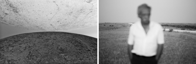
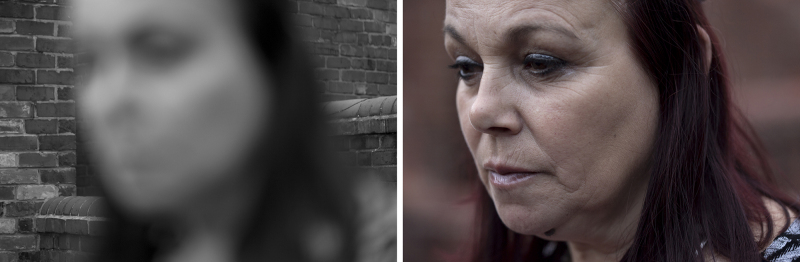
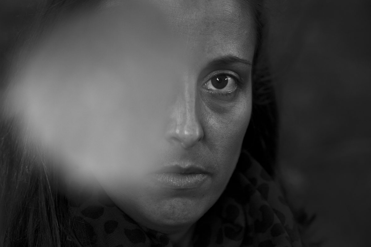
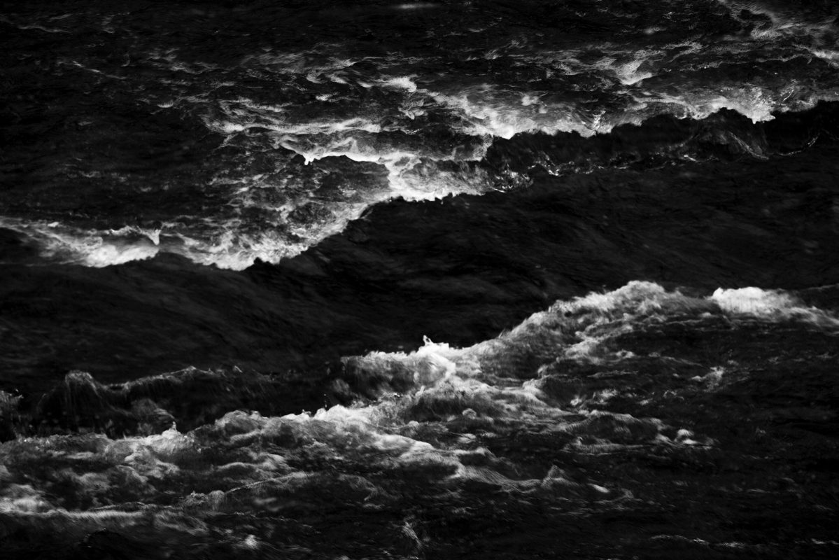
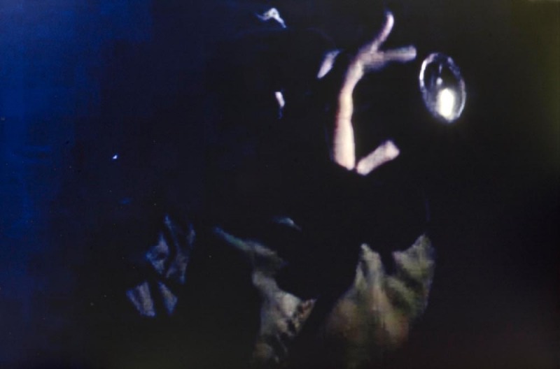
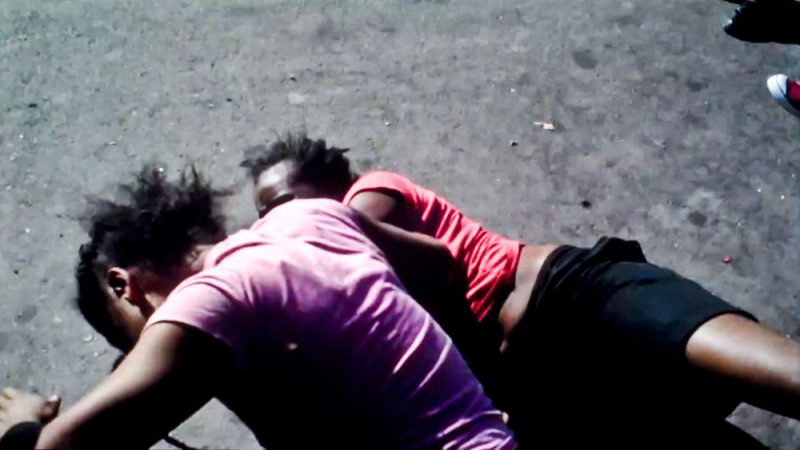
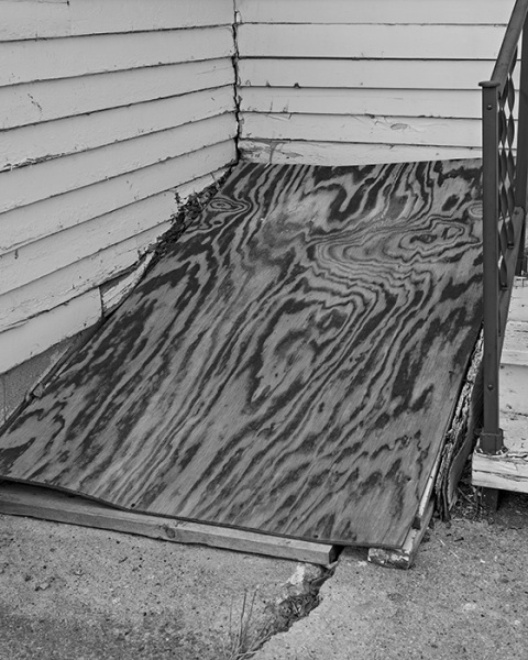
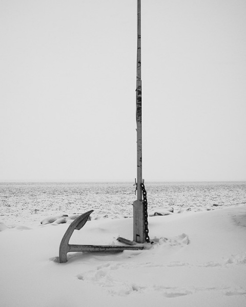
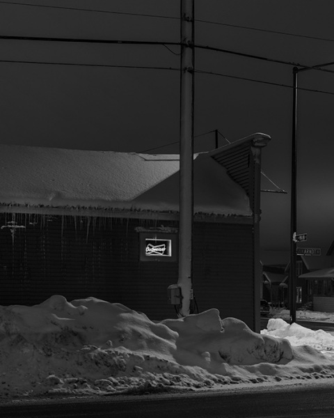
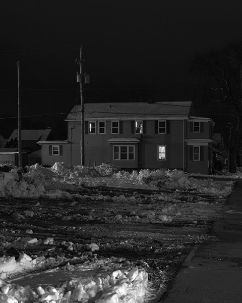
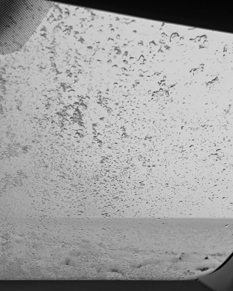
It is wild, this ability for me to get in there and navigate other people’s camera’s and hijack what I want. It is very dark and enigmatic. It is in this low light and darkness that I found ‘my’ aesthetic and my beauty… the breakdown of the digital resolution then became something gorgeous and powerful – and it allowed me to take away the identity of the subjects and let them speak for American machinations rather than individual stories.”

Probably the hardest trick for any photographer to pull off following the publication of a successful first book is the second. The ‘second album syndrome’, as they call it in the music business. Doug Rickard’s first book, A New American Picture from 2011, was not only one of the best photobooks of the last few years, it established him as a significant new voice in American photography. It wasn’t the only volume recently to feature images made from photographing off Google Streetview, but it is surely the most important, partly because Rickard’s pictures were so damn good, referencing (but not slavishly) most of the best American street photography from the past forty years, but also because Rickard did not forget the basic premise of photography – which is to comment upon contemporary life.

The book simply did not explore some of the issues centring around photography on the Internet in general – and Google’s ‘Big Brother is watching us’ in particular. It was also, as its title suggests, about a vision of America. Like the best photobooks, it pushed the medium’s boundaries, while at the same time gave us salient facts about today’s America. By means of Streetview, Rickard was able to ‘travel’ to places where it might have been difficult for him to take photographs in person. ‘The other side of the tracks’ it is called, dating from a time when America was much more segregated than today, and, especially in the South, the railway tracks often defined the boundary between racial neighbourhoods.

Although one would not stress the sociopolitical aspect of A New American Picture too much, it was definitely there, and although the book can be (and was) viewed in formalist and media terms, the documentary aspect was also important to Rickard, who has a particular interest in the Civil Rights period of American history.

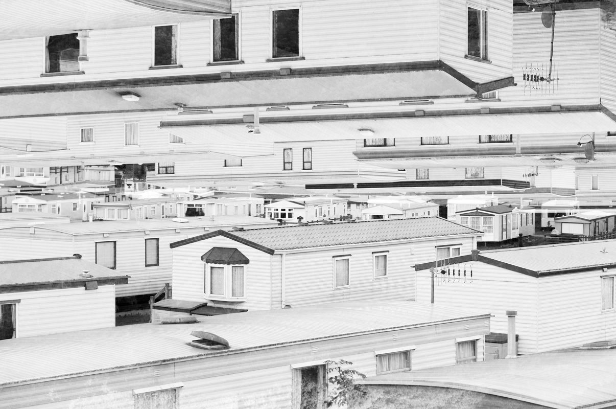
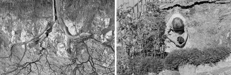
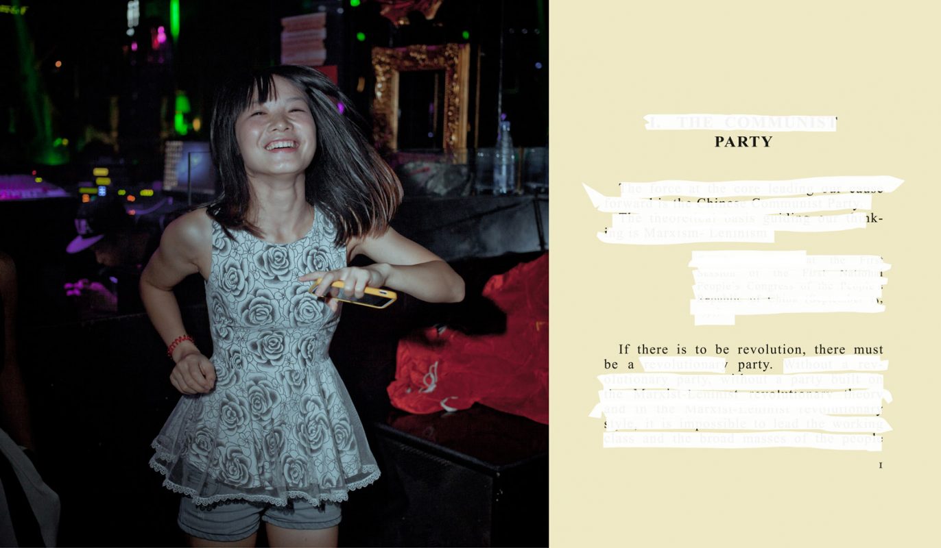
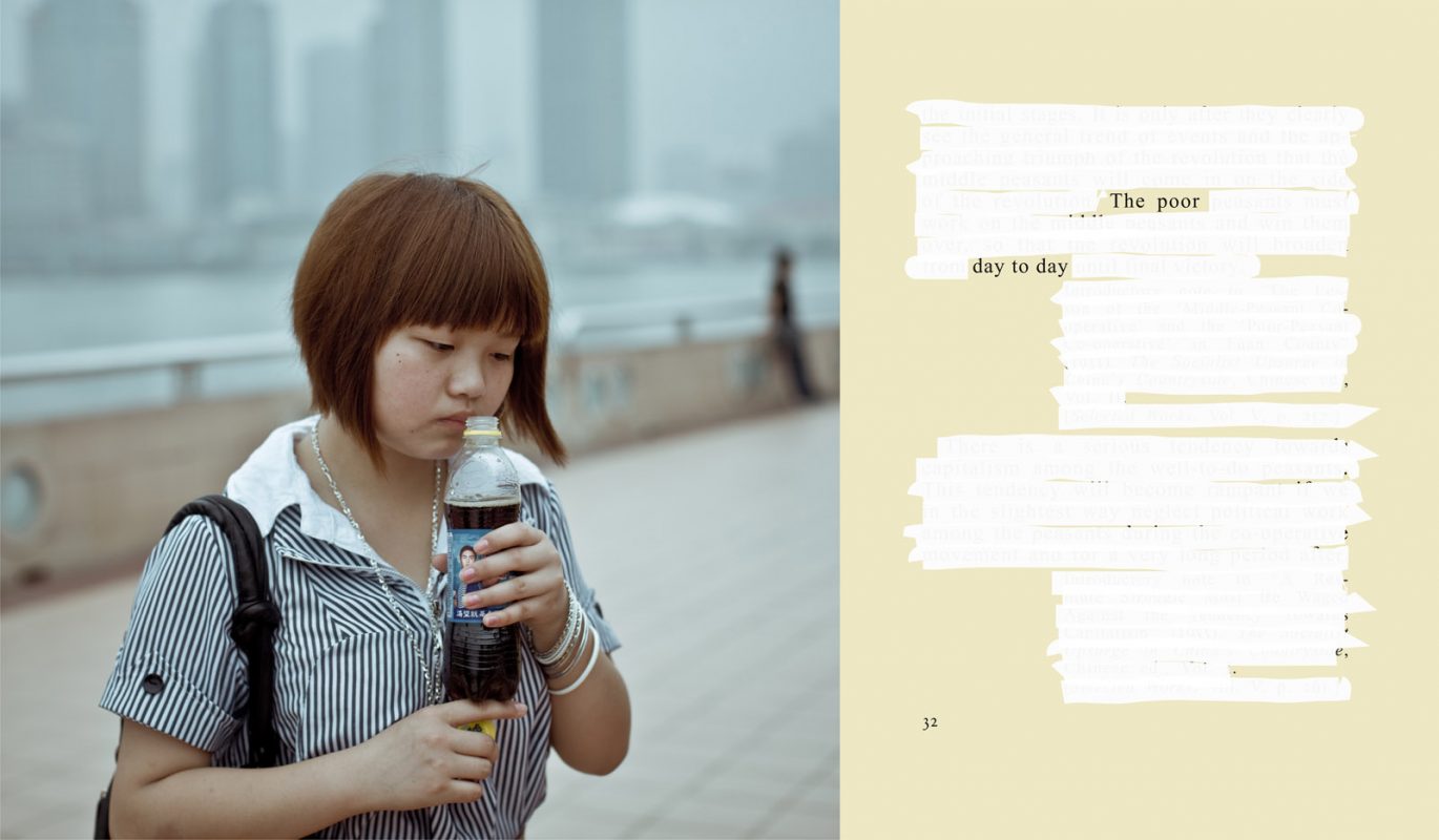
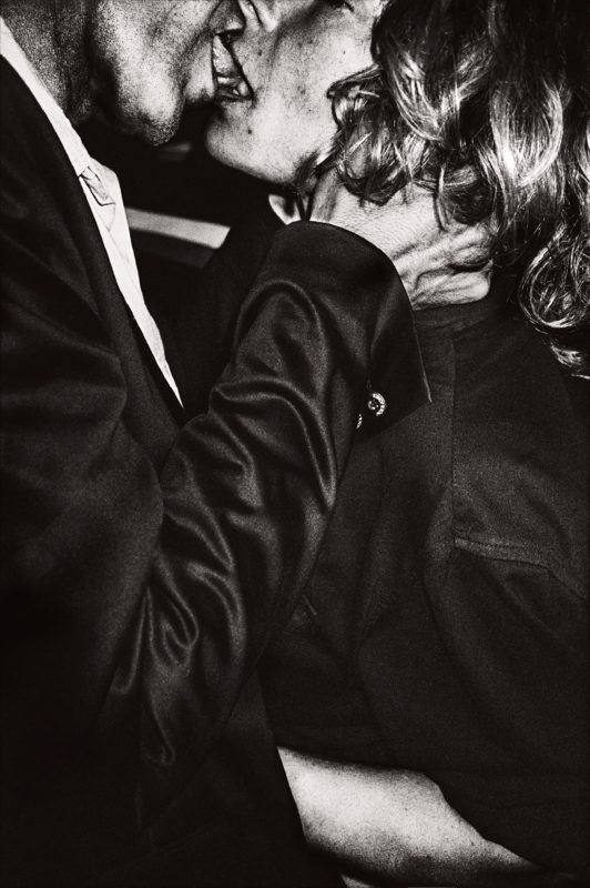
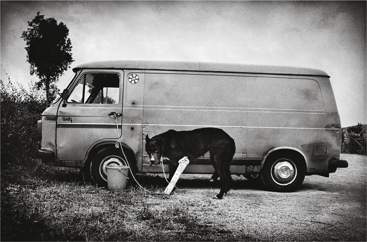
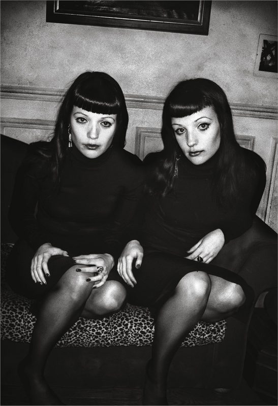
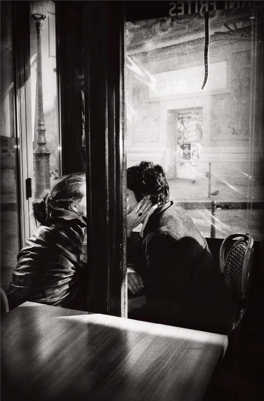
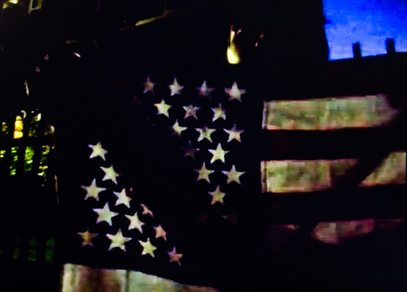
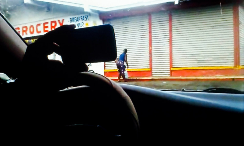
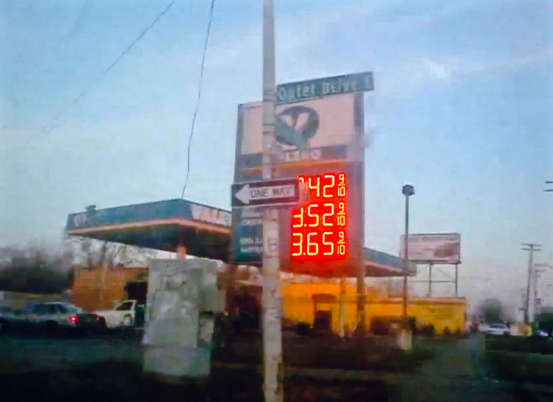
What is clear is that Rickard is part of a generation of American photographers who, without particularly shouting about it, have been documenting the state of the Union during the recent recession, and when American society, for various reasons – including implicit racism against a black president and the rise of China, as well as economic downturn – is suffering something of an identity crisis. The sense that there are two Americas, one definitely on the wrong side of the tracks, continues in Rickard’s new book N.A (the title stands for National Anthem), which continues the current tradition of American documentary photography, essentially telling stories about the country. And Rickard’s story is bleaker, and angrier than most. But ‘documentary’ – is this quite the way to describe a book largely compiled from blurred screen grabs from You Tube videos?

It’s always been a difficult genre to define. Walker Evans was always careful to talk about photography in the ‘documentary mode’, and the term ‘telling stories’ seems apt, in regard to Rickard’s work in general and this book in particular. In N.A, Rickard takes his imagery, from various Internet sources – mainly non-commercial, personal videos posted on You Tube. It might be described as ‘constructed documentary’, but then much more documentary is constructed than we might care to admit. As John Gossage has remarked of photography in general, “It’s all fiction anyway.”

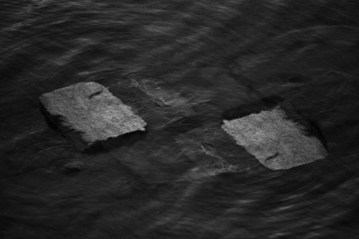
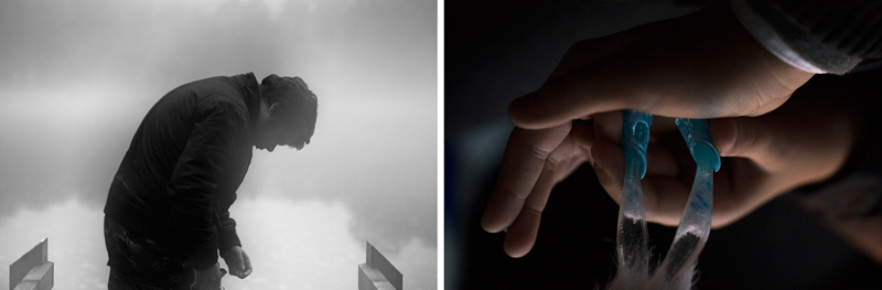
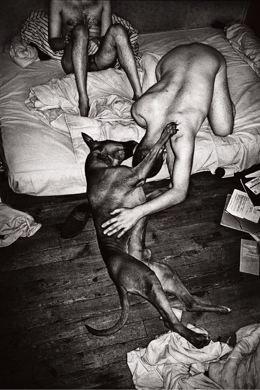
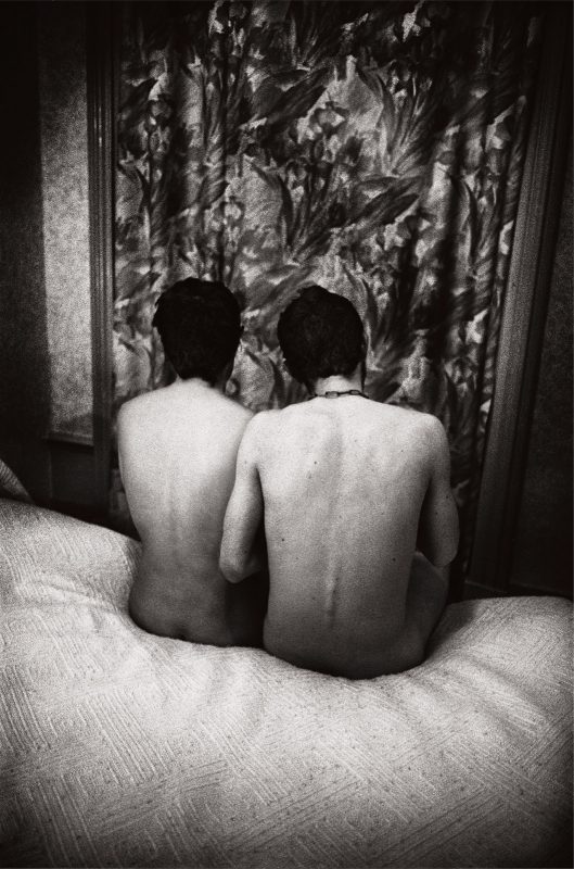
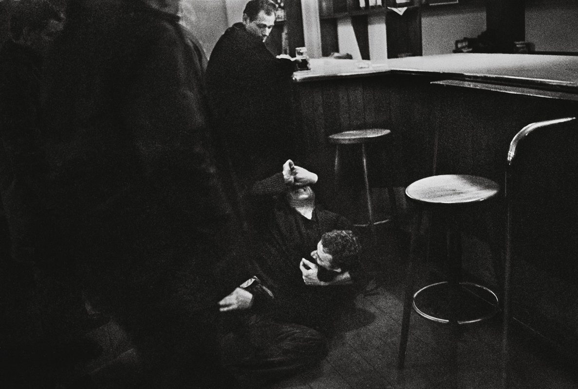
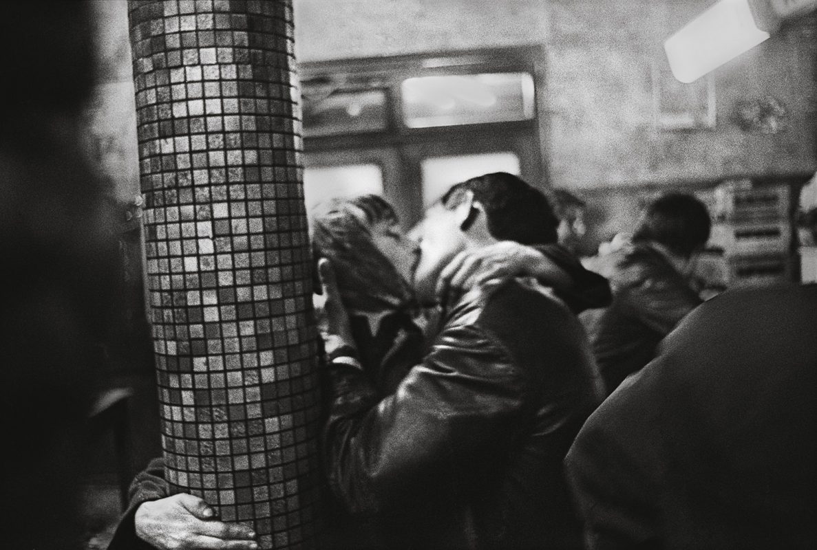
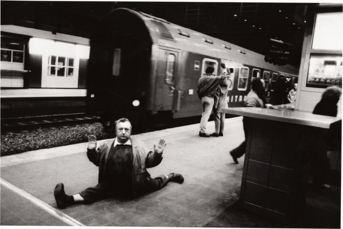
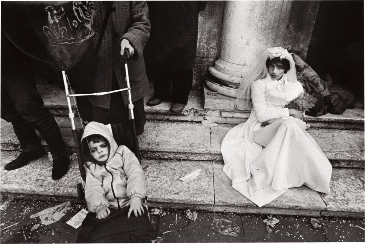
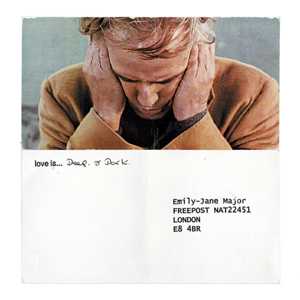
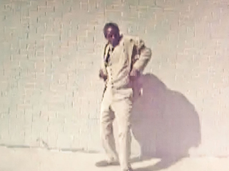
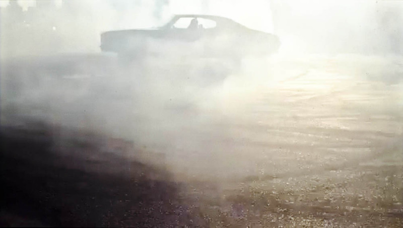
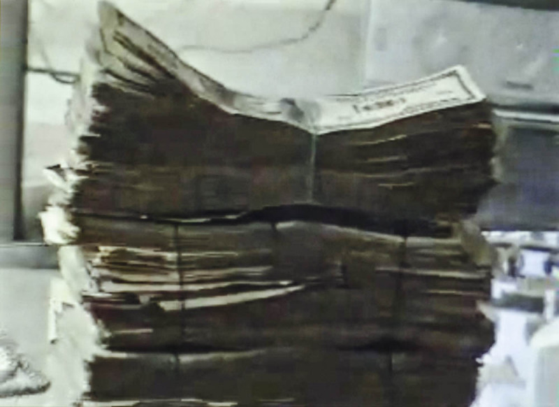
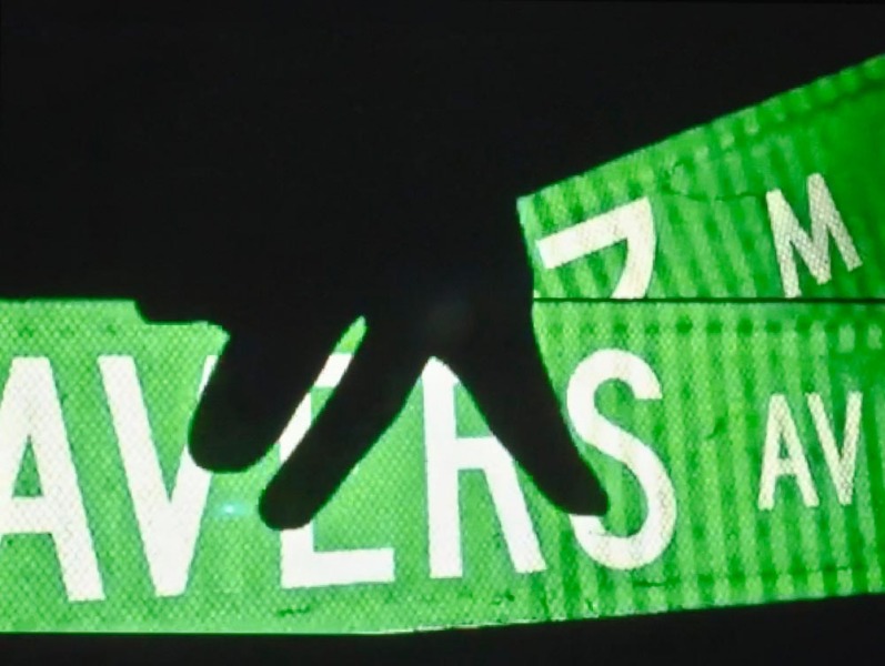
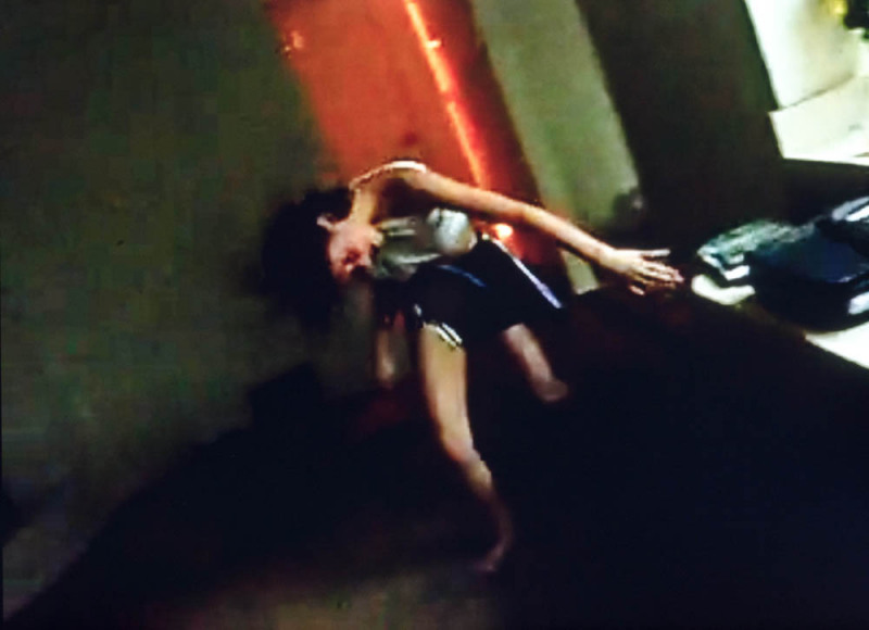
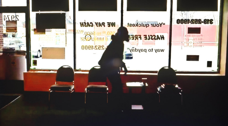
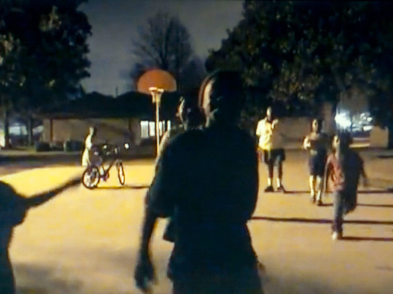
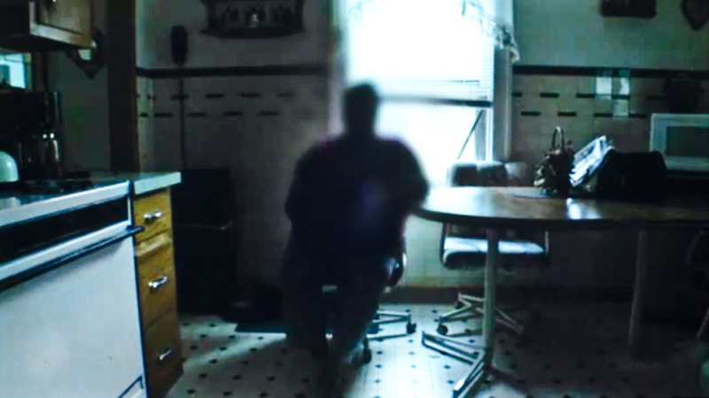
Keeping that tricky word ‘fiction’ in focus, in N.A Rickard seems to have reinvented the ‘photo-romain’ – the photo-novel. And just as that 1950s European genre influenced Japanese photography and the Provoke movement, N.A has more than a whiff of Provoke about it, especially in terms of its wildness and indeterminacy. N.A is a mood piece, but a very superior mood piece, all sideways glances and half lights. N.A is street photography, but not as we know it. It is street photography as might be practiced from an unmarked surveillance car, or someone being sneaky with a phone camera – and God help you if you’re caught.

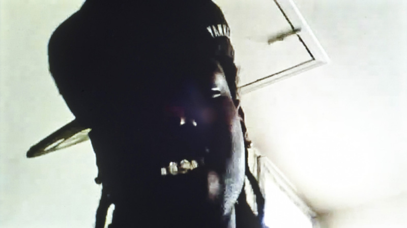
Here, we are in the territory of such gritty American crime TV series like The Wire, a world of flop houses, seedy bars, and crack dens – and of course street ‘characters’, some with guns, some hooded, most desperate. One hooded figure with a beard in particular looks as if he had strayed in from Paul Graham’s a shimmer of possibility. This is similar territory, but whereas Graham was contemplative, Rickard crackles with menace.

Some might feel that there is too much menace, whether mock or real, and that these images are a series of stills from a Hollywood movie rather than a photobook. That is to say, it is perhaps too melodramatic, too posturing, in the way of the videos he draws from. And yet, the very people he depicts take many of their attitudes to life and body language from fictional depictions, whether from film, You Tube, or gangsta rap.

Art imitates life which then imitates art, in not just an endless loop, but these days an almost instantaneous loop, so the question of what came first, life or art, becomes completely blurred and confused. And certainly one thing that N.A demonstrates is the confusion of life, the confusion between hope and despair, between freedom and servitude, cause and effect – and the fact that in the ‘land of the free’ many people lead lives constricted by politics and economics.

We rightly should be wary of too much fiction in photography, but if it is put firmly at the service of truth, the constructed documentary can be a powerful tool. N.A is an interesting new departure for Rickard, except it seems that it was in the pipeline all the way.

All images courtesy of the artist. © Doug Rickard


Gerry Badger is a photographer, architect and photography critic of more than 30 years. His published books include Collecting Photography (2003) and monographs on John Gossage and Stephen Shore, as well as Phaidon’s 55s on Chris Killip (2001) and Eugene Atget (2001). In 2007 he published The Genius of Photography, the book of the BBC television series of the same name, and in 2010 The Pleasures of Good Photographs, an anthology of essays that was awarded the 2011 Infinity Writers’ Award from the International Center of Photography, New York. He also co-authored The Photobook: A History, Vol I, II and III with Martin Parr.

Christian Patterson

Bottom of the Lake

Essay by Lisa Sutcliffe

Bottom of the Lake brings together Christian Patterson and Paul Schiek, both from Fond du Lac, Wisconsin, a city of nearly 45,000 people perched on the southern end of Lake Winnebago. The city’s name is French for ‘bottom (or foot) of the lake,’ from which the series of photographs draws its name. In 2006, Schiek, the founder of TBW Books and a photographer himself, began a subscription series of four annual titles, which would include both emerging and well-known artists. Patterson’s group includes Raymond Meeks, Alessandra Sanguinetti, and Wolfgang Tillmans and each book is identical in size, shape, and binding, like a periodical. Taking advantage of the opportunity to make personal and poetic work, Patterson made the pictures over two days when he was home for the holidays. The resulting photographs reveal less about the place than they do about a way of seeing. Indeed, it is difficult to discern much, if anything, about the lakeside city from the abstract and enigmatic pictures. So what do we see?

A few themes are immediately apparent and provide an outline for Patterson’s forensic methods and focused vision. Weaving together diverse visual threads, which overlap again and again, and maintaining the emotional distance he employed in the critically acclaimed Redheaded Peckerwood, Patterson challenges us to analyse and dissect his book, as if it is a problem waiting to be solved. He employs an approach that has come to define his bookmaking: multi-faceted storytelling using a specific colour palette punctured by black-and-white pictures and comprising still-life, landscape, appropriated material, drawings and objects.

Two subjects, a phonebook and a lighthouse, recur throughout the sequence, serving as a key to understanding the structure of the work through time and place. The book opens and closes with an image of the first Yellow Pages published in Fond du Lac after Patterson’s birth. Returning to the time he was born, he presents us with the page that lists taverns, many with colourful names, such as Inn-Ka-Hoots and Attitude Adjustment Hour. How can a city of 45,000 support so many bars, he seems to ask? Patterson sets out to discover which of these pubs from 1973 still exist. As his exploration progresses, we discover matchbooks from these locales posed as fictional advertisements, clip art from the phonebook, and the extant taverns themselves. Apart from the drinking culture, Fond du Lac is known for its lighthouse – a beacon on the shores of the lake. By photographing the interior walls of the lighthouse and the ‘X’ beams that support the structure itself he transforms the town icon into an unrecognisable abstraction. It is as if Patterson returned to his hometown on a mission of discovery: using the yellow pages as his map, the lighthouse as his bearing and the taverns, landscape, and ephemera as signs to be read. The contrast between how the town is publicly known (a safe harbour at the edge of a lake) and the darker connotations that come with a pastime of drinking presents a clinical response to the uncharted perils of harsh winter living.

The polysemous title, Bottom of the Lake, references the literal translation of the city’s name and its location, and also elicits a mood drawn from the deep depths of murky water. The pictures themselves are silent and cold, as if submerged. Colour is an important element in setting this mood. Patterson, who worked with William Eggleston and whose first book, Sound Affects (published by Kaune Sudendorf in 2008) emphasised the relationship between colour and musicality, is savvy in his ability to coax feeling (or the lack thereof) from colour. Both Sound Affects and Redheaded Peckerwood embraced a saturated, even acidic palette that popped against the black-and-white ephemera he so adores. In Bottom of the Lake, the spectrum is confined to a specific blue niche (between a pale sea green and robin’s egg – drawn from the cover of the 1973 Yellow Pages) as if Patterson had translated the crystallised mist of a cold winter day from the air onto emulsion. Each page has only the essential colours against a wood grain that sets the neutral tone – and even the black-and-white pictures are stark, cold, flinty, and crisp.

The taverns, all in black-and-white, enhance this sense of coldness. Often dark and run down, the buildings show their age: a distinct American type, decrepit, with peeling paint and dripping icicles. We never see the interiors or the patrons that keep these establishments in business. The snowdrifts in the foreground build an extra barrier between us – distancing us further from their warmth. It seems as if we’re on a midnight tour, and signs of life are distant or hidden. The depiction of these buildings as aged and frozen evokes both the passage of time and the impossibility of return and the simultaneous memory that remains unchanged.

The series rewards close looking; while the contextual relationships are slower to emerge, formal patterns unite the pictures. Landscapes, images of snowfall, and wood grain seamlessly interweave the progression. Many of the pictures refer to the lighthouse and the landscape surrounding it: the stone monument at its base and the cornerstone, so worn that it no longer reveals the 1933 date the lighthouse was built. These abstract references to the landmark have resonance for the artist, but for us they are sculptural, detached, the connections intangible. Patterson explains, “In the short period of time that I spent making this work, several motifs emerged – the colour blue, snow, stone, water and wood. These natural elements are a common part of life in this northern lakeside town. I was also interested in their abstract visual qualities, and their abilities to resemble one another. There are photographs of snow that resembles stone, wood that resembles water, stone that resembles wood, water frozen into ice, and snow melting into water.”

Bottom of the Lake is not a story about returning home, instead it speaks to transformations in vision and point of view as one evolves as a person. Patterson notes, “I now see Fond du Lac through a strange prism with many different sides – the faded, hazy views of a native, a son, a child, an adolescent and a teenager; the clearer, more discerning eyes of an adult; and now, I hope, the more perceptive gaze of an artist. I guess that gaze is more than just one side of the prism; it is the prism itself.” 

All images courtesy Rose Gallery and Robert Morat Galerie. © Christian Patterson.


Lisa Sutcliffe is the curator of photography at Milwaukee Art Museum.